
Hello and welcome to my blog about cool design principles that I have found. For my first post I am going to tell you all about this really well designed business card I found floating around the web. It was originally found here http://thedesigninspiration.com/blog/2018/01/14/ph-d-business-card/
However the design was linked to http://velikiydesign.tumblr.com/
Go and check out more designs that the author has made if you enjoyed this one.
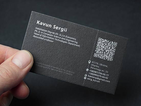

Okay lets get started on this great design. I plan to reverse engineer this design process and have marked up the business card for easier locating. I will refer to the numbers for each principle of design. This should make it easier to find and locate.
For number on the principle that I am identifying is alignment notice how the name and degree information are all aligned left making it easier to read and locate information. If you notice on the right hand side of the business card they are also aligned left. In fact the entire business card is aligned left except for the bottom portion which is not.
For number two I would like to point out the repetition. While you might have noticed above that the left alignment was repeated number two is pointing out how the very small graphics are using repetition. For instance they are all the same size. Also the text next to them is same fount leaving the reader of the card to believe that these things are related.
Number three is proximity. While the name and degree information are two different sizes and fonts when they are grouped this close together they look like they belong together. Also you can see this principle on the opposite side of the card with the contact information.
Number four is contrast. This is an easy card to tell contrast on since it uses the best contrasting elements. Those would be black and white. This makes the card really stand out and look different. If this business card had more then these two colors it would muddy the design and not make it stand out as much.
Number five is color. This card only uses two colors if you choose to call black and white colors. While this does not use much of the color theory this creates a dynamic effect by using the two best contrasting colors. Which I have described in the paragraph above. The black and white also make it look more professional and do not distract from the overall card.
In conclusion this is a simple but effective design that contains lots of design principles. In fact it contained all the design principles that I have learned about in class. It even has some that we did not go over like great use of negative space.
